The Distortion We Grow Up With
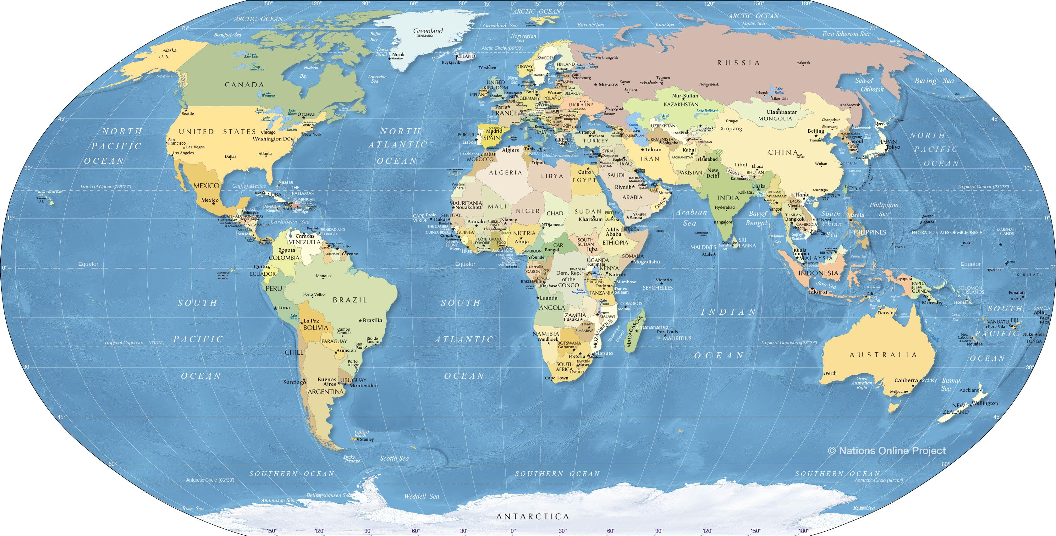
Look at a classroom globe. Spin it. Watch the continents blur into a colorful mosaic of blue and green. Your finger traces familiar shapes: the bulky mass of North America, the sprawling curve of Eurasia, the lean dagger of South America.
Now, stop the sphere. Rest your finger on Africa. If you enjoyed this piece, you should check out: this related article.
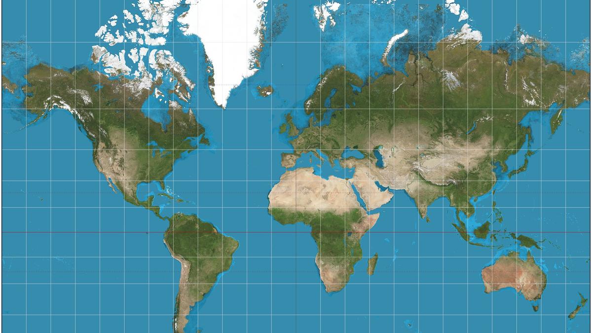
To the eyes of a child sitting in a Midwestern middle school or a high-rise apartment in London, Africa looks roughly the same size as Greenland, maybe a little larger. It sits comfortably in the center, flanked by oceans, appearing as just another puzzle piece in the vast atlas of human geography.
Except it is a lie. A quiet, geometric lie printed on millions of maps for more than four centuries. For another angle on this event, see the recent coverage from TIME.
(Note: When I refer to the map, I am speaking of the Mercator projection, created by Flemish geographer Gerardus Mercator in 1569.)
Imagine standing in a classroom in Kinshasa or Nairobi, looking up at that same map. You are being asked to navigate a world that has shrunk your home into a footnote. You are told, through silent visual conditioning, that your continent is a minor player on the global stage.
The truth is heavy.
Africa is massive. You could fit the United States, China, India, Japan, and most of Europe inside its borders all at once, and you would still have room left over for a few mid-sized European nations. Greenland, that icy behemoth that appears shoulder-to-shoulder with Africa on standard flat maps, is actually about fourteen times smaller.
Yet, for generations, we have allowed a sixteenth-century navigation tool designed for sailors crossing the Atlantic to dictate how we perceive the geography of an entire planet.
The Cartographer’s Dilemma
To understand why this happened, we have to step back to a time when ships wooden-ribbed and canvas-winged crossed the open seas using stars and compasses.
Gerardus Mercator did not hate Africa. He did not sit in his workshop plotting a malicious campaign to diminish the global South. He had a very specific, practical problem to solve.
He needed to map a three-dimensional globe onto a two-dimensional sheet of paper for sailors. If you peel an orange and try to flatten the peel without tearing it, you cannot do it. You stretch it, distort it, warp it. Mercator chose to preserve angles and directions. For a sailor plotting a straight course across the ocean, straight lines on a Mercator map meant a true compass heading.
The trade-off was brutal.
As you move away from the equator toward the poles, landmasses stretch. They balloon. They expand out of proportion. Europe and North America sit comfortably in the mid-to-high latitudes, reaping the benefits of this cartographic inflation. Greenland, Canada, and Russia puff up like winter coats.
Meanwhile, Africa straddles the equator. So does South America. Sitting at the center of the world, they remain true to their size. Unstretched. Unbloated.
And because they do not benefit from the poleward inflation, they shrink by comparison.
Think about what happens to the human brain when it sees this every single day. Visual bias is insidious. We trust our eyes implicitly. If a map tells us that North America dominates the northern hemisphere while Africa is a modest block tucked underneath Europe, we internalize a hierarchy of scale. We confuse physical size with global importance.
Consider a hypothetical student named David, growing up in Lagos. David loves geography. He spends hours staring at the world map pinned to his bedroom wall. He sees his country, Nigeria, squeezed into a corner of West Africa, looking dense but small. When he reads international news about economic powerhouses, climate change negotiations, or global trade, the map whispers a subtle untruth to him: You are at the periphery. The center of gravity is elsewhere.
The map becomes an architect of self-doubt.
The Gall-Peters Correction
For decades, cartographers, historians, and educators have tried to fix this.
Enter the Gall-Peters projection, introduced to widespread controversy in the 1970s. Unlike Mercator, Peters prioritized equal area. On a Peters map, landmasses are proportional to one another. Africa finally looks like the titan it is—stretching from the Mediterranean in the north to the Cape of Good Hope in the south, a colossal landmass spanning nearly twelve million square miles.
When people first see a Gall-Peters map, they often feel disoriented.
North America looks elongated, almost melting downward. Europe appears squished. People laugh, call it ugly, and reach back for the familiar comfort of the Mercator projection. We are creatures of habit. We prefer the lie we grew up with over the truth that makes us uncomfortable.
Critics of the Peters map argue that it distorts shapes. Greenland looks like a long, thin shred of paper rather than an island. South America appears stretched out vertically.
And they are right. You cannot flatten a sphere without distortion. Every map is an act of compromise. Every flat representation of the earth chooses what to distort and what to preserve.
The real question is not whether a map is perfect. No map is. The real question is: Whose interests does the distortion serve?
When the standard map of the world visually minimizes the second-largest continent on Earth, it reinforces a global power dynamic that has existed for centuries. It makes it easier to overlook Africa’s economic potential, its demographic explosion, its cultural dominance, and its critical role in the future of the human story.
The Shift
Change is happening, though it is agonizingly slow.
Look at modern digital maps. When you zoom out on Google Maps or Apple Maps using the Web Mercator projection, Greenland still looks massive, but digital technology allows us to bypass the physical constraints of the classroom pull-down map. Yet, even digital interfaces inherit the sins of the Mercator grid.
Some schools, particularly in places like Boston, have begun adopting equal-area maps in classrooms, replacing the Eurocentric bias with geographical reality. Teachers watch students' eyes widen the first time they realize that the continent they live on or trace their heritage to is vastly larger than they were led to believe.
It is a small moment. A shift in ink and paper.
Yet, representation matters. When a young person looks at a map and sees their home rendered with accurate scale, something shifts in their posture. The invisible weight of marginalization lifts just a fraction.
We are living through a century where Africa is driving the future. Its population is the youngest on earth. Its cities are booming tech hubs. Its creative industries shape global culture. Its natural resources and renewable energy potential are central to the survival of the planet.
The old map belongs to an era of empires, sailing ships, and colonial boardrooms.
It is time to fold it up, put it in the attic, and look at the world as it actually is.
A spinning blue sphere, perfectly balanced, holding a continent that has always been far greater than the paper could ever contain.