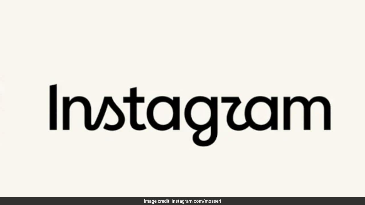
Visual asset updates in mature digital ecosystems rarely occur for purely aesthetic reasons. When Instagram altered its wordmark logo, moving away from a decade-old typographic standard to a refined visual presentation, the change functioned as an operational adjustment rather than a simple cosmetic refresh. At scale, typography must solve specific mechanical problems across varying viewports, high-density display technologies, and multi-platform user interfaces.
Evaluating this transition requires moving past surface-level design commentary to examine the economic and technical drivers behind digital typography standardization. Platforms with billion-user distribution architectures must optimize every rendered pixel to preserve visual hierarchy, maintain cross-platform recognition, and adapt to shrinking interface real estate.
The Functional Imperative Of Typography At Scale
Enterprise identity assets must satisfy distinct performance criteria that differ fundamentally from print or static branding environments. A digital wordmark serves as a UI component, an anchor for navigation, and a trust signal.
Rendering Constraints Across Hardware Variations
At sub-20-pixel display sizes on mobile devices, complex humanist terminals or decorative flourishes introduce rendering friction. Subpixel anti-aliasing behaves inconsistently across different operating system rasterizers and screen resolutions. A heavier baseline stroke weight or overly ornate curves create visual artifacts, causing character distortion at low viewports.
The structural evolution of the Instagram wordmark prioritizes legibility optimization. By refining counter spaces and standardizing stroke contrast, the asset minimizes rendering degradation across legacy and modern hardware. This ensures consistent brand transmission whether the application renders on a high-end OLED panel or a budget smartphone screen operating under constrained processing resources.
Architectural Consistency In Multi-Brand Portfolios
Digital holding structures and parent companies increasingly enforce unified design tokens to streamline engineering workflows. When a dominant platform updates its primary identifier, the change frequently aligns with an internal design system consolidation. Standardizing typography reduces technical debt within component libraries, allowing front-end engineering teams to implement design tokens via shared style sheets without managing fragmented asset variants.
The Economic Drivers Behind Typographic Refinement
Brand equity valuation for digital platforms is tied directly to visual efficiency. Every millisecond of cognitive load required for a user to process an interface element introduces friction into the user journey.
Minimizing Cognitive Overhead In Navigation
Interface design relies on immediate pattern recognition. The human visual cortex processes recognizable typographic forms faster than dense graphic icons alone. By cleaning up the letterforms within the wordmark, the platform reduces the visual noise surrounding primary action hubs, such as the application header or profile headers.
The economic benefit manifests in reduced user hesitation. While infinitesimal on an individual interaction, across trillions of annual impressions, lowering cognitive friction preserves attention spans and supports engagement continuity.
Omnichannel Adaptability And Spatial Efficiency
Modern interfaces distribute brand marks across highly disparate surfaces:
- Physical out-of-home advertising billboards requiring extreme distance legibility.
- Compressed mobile application icons and splash screens operating within strict spatial parameters.
- Wearable device displays where vertical and horizontal pixel counts are severely restricted.
- Immersive augmented reality or virtual reality UI overlays requiring vector crispness at varying focal depths.
A simplified typographic structure provides higher yield across these disparate spatial constraints. Complex geometries that read well on a desktop monitor often fail when compressed into favicon formats or notification banners. The updated wordmark achieves spatial efficiency by optimizing the bounding box of the text string, allowing developers to allocate more viewport acreage to core user-generated content.
Deconstructing The Design Methodology
Transforming a legacy digital asset requires a rigorous audit of existing visual equity versus emerging technical demands. Brand managers face a binary choice: preserve historical continuity or optimize for future distribution channels.
The Cost Function Of Brand Heritage
Retaining an outdated visual asset incurs a hidden maintenance tax. As product ecosystems expand into new software categories, legacy fonts often lack the character sets required for international localization, specialized numerical formatting, or dynamic weight adjustments.
Conversely, sweeping typographic changes risk alienating core user segments who anchor their trust in familiar visual cues. The strategy deployed in this update mitigates this risk through an evolutionary rather than revolutionary approach. The foundational silhouette remains intact, preserving institutional memory while modernizing the micro-geometry of individual glyphs.
Systematic Optimization Of Glyph Geometry
To achieve optimal balance, type designers manipulate three core variables during an enterprise rebranding initiative:
- X-height ratios: Adjusting the height of lowercase letters relative to capital letters to enhance reading speed at small scales.
- Terminal angles: Cutting stroke ends at specific geometric degrees to control ink bleed in print or pixel bleeding in digital rasterization.
- Tracking and kerning matrices: Standardizing the spatial intervals between character pairs to prevent optical crowding when the wordmark scales down.
These adjustments operate as a coordinated system. Altering a single variable without accounting for its downstream effect on adjacent glyphs compromises the structural integrity of the entire brand mark.
Strategic Execution In Digital Identity Management
Transitioning a global visual identity demands strict protocol adherence to prevent fragmented brand deployment. Engineering and design operations must execute updates across millions of touchpoints simultaneously, ranging from server-side asset caches to embedded software development kits used by third-party integrations.
When executing an asset upgrade of this magnitude, organizations must establish a deterministic asset pipeline. Design systems must distribute the new vector files concurrently with deprecation schedules for legacy components. Failing to manage this transition cleanly results in brand fragmentation, where outdated marks persist within third-party embeds, marketing collateral, and localized application builds for years after the official announcement.
Deploy capital toward auditing all external API integrations, partner marketing kits, and enterprise developer portals to ensure immediate deprecation of legacy typographic assets across all third-party touchpoints.