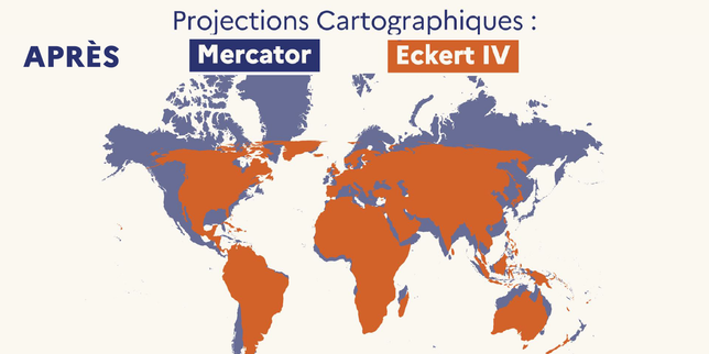
Every map you grew up looking at in school lied to you. It didn't just bend the truth; it warped physical reality to make certain parts of the world look massive while shrinking entire continents into insignificance. When France officially announced it was dropping the centuries-old Mercator projection for its official maps, it wasn't just an administrative tweak. It was a long-overdue reality check about how human eyes perceive global power and geography.
If you pull up a standard Mercator map right now, you will see a bizarre distortion. Greenland looks roughly the same size as Africa. In reality, Africa is about fourteen times larger than Greenland. North America and Russia stretch out like bloated giants across the top of the page, while countries near the equator look squished. Gerardus Mercator designed his projection in 1569 to help sailors navigate straight lines across oceans. He never meant for it to serve as an accurate portrait of a spherical planet on a flat piece of paper. Yet, classrooms and textbooks stuck with it for generations, baking a permanent geographic bias into our collective subconscious.
The Real Cost of a Distorted World Map
Geographic representation isn't just about drawing lines. Maps shape how children learn to value different regions of the globe. When an entire continent housing over a billion people appears shrunk down to the size of a minor landmass, it alters psychological perceptions of importance and development.
The shift toward fairer projections like Equal Earth isn't just happening in a vacuum. It follows years of pressure from international campaigns and organizations pointing out the deep flaws in traditional Eurocentric cartography. When French officials confirmed the change, they noted that diplomacy requires both an honest narrative and a truthful picture of the earth.
Oddly enough, dropping Mercator means France itself will look smaller on standard planisphères. European nations lose their artificially inflated northern heft when you map surfaces accurately. But that is the exact point of moving away from old habits. True geographical accuracy doesn't play favorites.
How to Spot a Bad Map in the Wild
You don't need a degree in geodesy to spot the flaws in most world maps. You just need to look at the edges.
- Check the poles. If Antarctica looks like a massive white continent wrapping around the entire bottom edge of the poster, or if Greenland looks as big as a continent, you are looking at a conformal projection designed for navigation, not scale.
- Look at the equator. Landmasses near the center tend to retain their actual proportions better on older maps, but everything north or south gets stretched vertically.
- Demand equal-area alternatives. Modern digital tools make it easy to switch views. Websites and educational software now default to projections that preserve true relative sizes.
Geographers have spent decades offering better alternatives. The Equal Earth projection, for instance, keeps continental sizes properly proportioned while maintaining a visually pleasing shape. It requires compromise, sure, because flattening a sphere always introduces some distortion. But it stops punishing the global south with perpetual miniaturization.
Changing How We Teach Geography
Adopting accurate maps in schools takes deliberate effort. Teachers have to unlearn the visual bias they absorbed as kids. School boards must replace outdated atlases that make northern countries look like titans.
If you design educational materials or run programs dealing with international relations, look closely at the graphics you use. Swap out standard web defaults for equal-area projections. Pay attention to the subtle messages your visual assets send about scale, territory, and global presence. Geography dictates trade routes, climate impact studies, and geopolitical strategies. Getting the proportions right is the bare minimum requirement for understanding the planet today.